Dive into a magical adventure where the quest of catching mystical creatures unfolds through the thrilling game of Receiver Operating Characteristic (ROC) analysis.
Let’s imagine a fun game on the computer where you’re trying to catch as many magical creatures as possible. Some creatures are super special (let’s call them “sparkly creatures”), and some are regular ones.
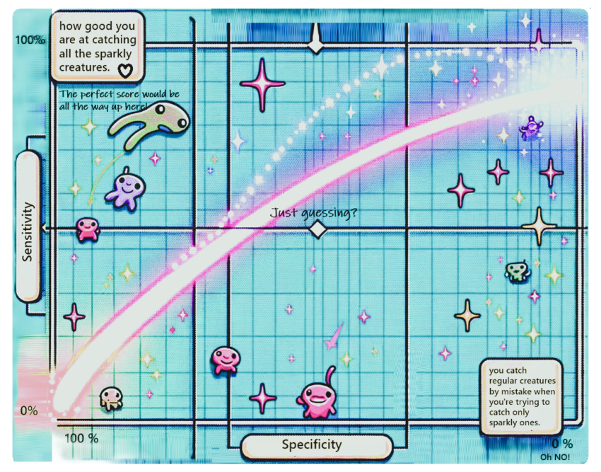
Now, imagine the game shows you a chart that helps you understand how good you are at catching these sparkly creatures without accidentally thinking regular ones are sparkly.
- The game area (chart): Think of the chart as a big game map. On one side (let’s say the bottom), it shows if you catch regular creatures by mistake when you’re trying to catch only sparkly ones. On the other side (let’s say the left), it shows how good you are at catching all the sparkly creatures.
- The magic line (ROC curve): There’s a line that moves across this map. When the line moves towards the top left corner, it means you’re doing an awesome job: catching lots of sparkly creatures and hardly ever getting fooled by the regular ones. If the line is closer to the diagonal middle (like a staircase from bottom left to top right), it means you’re guessing—you might catch sparkly creatures, but you’re also making lots of mistakes.
- The perfect score: If your magic line goes straight to the top and then turns right, it’s like you’ve got a magical net that catches all the sparkly creatures without ever touching a regular one. That’s the best score!
So, the ROC analysis is like a game score that shows how well you’re doing at catching the creatures you want (sparkly ones) without getting tricked by the others. The closer your magic catching line is to the top left, the better you are at this magical creature-catching game!
The Magic Behind the Game
This game of catching sparkly creatures isn’t just for fun—it’s a metaphor for the ROC analysis, a powerful tool used by data scientists to evaluate how well their models can differentiate between true positives (our sparkly creatures) and false positives (the regular ones mistaken for sparkly). The closer the magic catching line (or ROC curve) gets to the top left corner, the better the model is at making accurate predictions.
The Probability of Catching Sparkly Creatures
In our magical game, imagine each time you try to catch a creature, you’re not just blindly guessing. Instead, you have a magical net that tells you the probability, or chance, that the creature in front of you is sparkly. This probability helps you decide whether to catch it or let it go.
How Probabilities Shape the Magic Line
- Thresholds for Catching: The game allows you to set a “magic threshold” based on probability. If the probability of a creature being sparkly is higher than your threshold, you decide to catch it; if it’s lower, you let it go. Changing this threshold affects how many creatures you catch and how many you miss.
- Creating the Curve: As you adjust this threshold from very low (catching almost all creatures) to very high (catching only those you’re almost sure are sparkly), you change how sensitive your net is to catching only sparkly creatures versus avoiding regular ones. Plotting these changes on the map gives you the ROC curve. When the threshold is low, you catch many sparkly creatures but also many regular ones by mistake (high sensitivity, low specificity). As you raise the threshold, you become more selective, missing some sparkly creatures but also avoiding more regular ones (lower sensitivity, higher specificity).
- The Curve’s Shape: The curve’s shape comes from how the probabilities of catching sparkly versus regular creatures change as you adjust your threshold. It starts at the bottom left (catching none, missing none), curves upwards (catching more sparkly creatures, but also more regular ones), and eventually levels off towards the top left corner (catching most or all sparkly creatures with minimal regular ones caught by mistake). This progression reflects the trade-off between catching as many sparkly creatures as possible (sensitivity) and avoiding catching regular ones (specificity).
- Why It’s a Curve: The curve rather than a straight line because the relationship between catching sparkly creatures and avoiding regular ones isn’t linear. The effectiveness of your magical net (the probability-based decision tool) at differentiating between sparkly and regular creatures changes in a non-linear way as you adjust your threshold. This non-linearity, governed by the underlying probabilities, gives the ROC curve its characteristic shape.
Wrapping Up Our Magical Quest
In the game of “Catching Sparkles,” the ROC curve emerges from the interplay of probabilities—how likely you are to correctly identify and catch sparkly creatures without being deceived by regular ones. The curve visualizes the performance of your magical net across different thresholds, embodying the balance between eagerness to catch all sparkly creatures and caution to avoid regular ones. Just as in the game, in real-world applications, the ROC curve helps data scientists understand how well their models distinguish between true positives and false positives across various thresholds, guiding them to make better decisions based on the underlying probabilities.
Why Does This Matter?
In the real world, just like in our game, being able to tell apart the truly significant from the ordinary is crucial, whether we’re diagnosing diseases, forecasting weather, or filtering spam emails. ROC curves help us understand the effectiveness of our methods, guiding us to make better decisions.
So, next time you hear about ROC curves, remember the magical game of catching sparkly creatures. It’s not just about data; it’s about finding the magic in the numbers, leading us to discoveries that light up our understanding like the sparkles of our game’s most elusive creatures.