Here are some general principles to have in mind when working on visual illustrations, graphs, plots, charts, you name it.
Chosing the graph type
Think of which graph type is best in conveying the information you want. Ask yourself what your goal is. Sometimes it is best to draw what you picture on a piece of paper. Try it out, and try to challenge yourself. Is the context of the data coming across? Is there another way that conveys the information more clearly and simply? What should the reader be able to read from the graph?
You are doing the reader a favor by
- using a familiar graph type. This is quicker to read and easier to evaluate.
- avoiding unnecessary clutter/information. This includes avoiding unnecessary legends or gridlines.
- providing enough information to for the reader on to be able to read and evaluate the data on their own. This includes giving context and using explicit labelling, – dont let it be up to the reader to guess.
- order the output for the reader. This includes sorting the bars in a bargraph by value or category, or having gridlines when this is helpful.
To avoid common cluttering and design mistakes, I can recommend a blog by Mimi, which has a list of do´s and don´t for particular charts with grat examples (link here).
Find inspiration
The r-graph-gallery has has a big collection of graphs by chart type, https://r-graph-gallery.com/. Most are built in ggplot2 package.
The typical reader is not you
Be fair to your readers. Many might have less than perfect eyesight. They might have trouble differetiating colors that are too close to each other. They might be easily overwhelmed by too much going on on the page.
What you can do is to be aware of some of the most common issues people face and try to accommodate these. And you do this best by also being clear on what you are trying to convey, what is essential.
Accomodate most readers by thinking in human diversity in sensation and perception. Think in poor eyesight, color blindness, the fast paced (scrolling) world, and the stressed or easily distracted mind. Give enough information, guide the reader, and avoid adding unnecessary distrations and noise.
If the colors are important for reading the graph correctly, then make sure the colors can be read by color blind people as well.
Ensure that the text is readable, ensuring adequate font size, and readable font style and color.
Avoid noise / distractions in you illustration. This can be a process of killing your darlings. Does the feature have a practical purpose? If not, then revise. As example, a 3D graph is seldom practical and likely to add more noise than needed.
Guide your reader, by e.g., color-coding, sorting output, or otherwise highlighting where you need the reader to focus.
I can recommend looking at some writings on UX and color blindness:
Accessibility: Improving The UX For Color-Blind Users
Two Simple Steps to Create Colorblind-Friendly Data Visualizations
Heavy duty vs quick pitch
All types of graphs deserve to be visually stunning, which is both a matter of what the context demands and what style you can deliver.
If you are providing data in a graph in the scientific manner, where you want the reader and reviewers to be able to evaluate the data, you need to give a fuller picture. A good graph in this sense gives a good overview, it has a self-explanatory title and caption, properly labelled axis, notations and error bars where appropriate. You can go all out on the information side, and target the styling towards supporting the information. Trending colors are here less important.
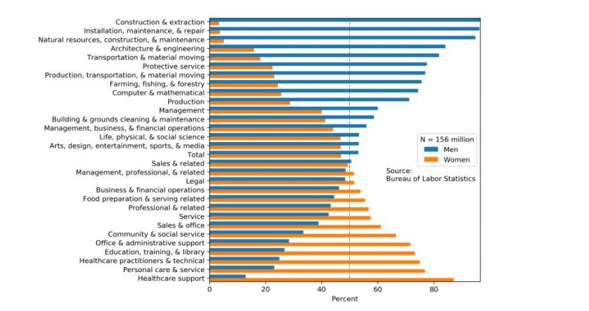
If you are doing analytics of the kind that is highlighting parts, some insight that is easy to share, then less is more in terms of details and information. On the other hand you can go all in on the style front. Think infographics, with less text and more trending graph features (color palettes and font styles) – easily digestable and maximum impact. What to scrape and what to highlight is the question. And maybe images or logos are included in the graph, as in the graph shown below (link).

Interactive graphs
Simple is usually better, – but sometimes a responsive graph can be helpful. For example, when choosing a category by a drop down menu is the best alternative to showing multiple graphs. Other times, the added interactivity is supplemental or expanded information that should either be available in the graph itself or is not otherwise essential information.
Adding interactivity, can become noise, and in that case it may not be helping the reader. Dont let the reader rely on supplemental or expanded information that should be assessible on the get go. Let the graph stand on its own.
Other times, an interactive experience with data can give the reader a fuller experience.
You need to ask the questions, is an interactive graph helpful to the reader here or are you just trying to impress? Can the information be conveyes more simply and/or clearly? Is the reader interested in putting time and effort in explore the interactive elements or are you just adding unnecessary noise.